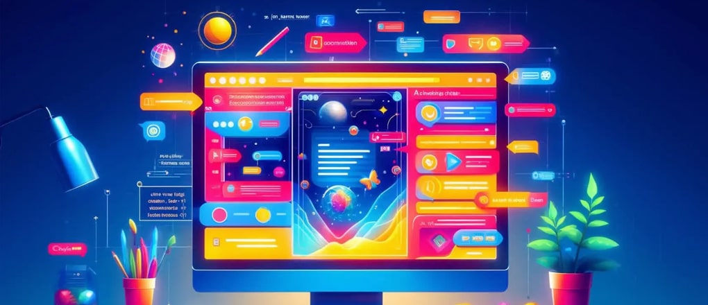
We love the use of animation and the awesome effect it can bring to a website, adding a unique and a modern touch to any design.
The early years of web design used to involve Flash animation, which has become a lost skill, but these days you can do some amazing tricks with HTML5, JavaScript and even just CSS transitioning alone.
Below we have listed 5 simple tips to help when looking at adding animation to your website:
1. Subtlety
The first rule for any animation is subtlety. Good animation should be like a good referee – you shouldn’t notice its presence but it’s working in the background improving the experience. Don’t make the animation all singing and dancing that it ends up confusing or distracting the user from what you want them to actually achieve, or worse still – annoying them that they don’t even want to visit your site or leave early.
2. Have a Purpose
Make sure any animation you use has a purpose and makes sense to the design and user experience – don’t just add for the sake of it or because you think it’s something fun or makes things more modern. Make the animation guide the user through the site, highlight certain elements, or be a part of the brand itself for instance.
3. Be Intuitive
Any clunky movement or transitions instantly takes the user out of that “modern, clean” feel. This will play into their subconscious and they’ll get the same impression of your company. Make sure any animation used is natural, slick and smooth and flows nicely from one state to the other, if not then you’re better off removing it.
4. Think about Load Time
Load time is crucial on websites these days, users can get frustrated in just a few seconds if things don’t load and it can even hinder your SEO rankings. So make sure any large videos for instance are well optimised, high res images in sliders or animated galleries are optimised and kept to a minimum. CSS and HTML5 animations will be very minimal on load time anyway so these are perfect to use.
5. Be Creative
Don’t just add animation to your site because everyone else has it. Such examples are: sliding banners, fading in content on scroll, and parallax images. These became super popular to the point where you just look like every other site and there’s nothing unique or different about you. By all means use them if it make sense, but sliding banners can be non-user friendly because you have to click multiple arrows to see certain content, fading in content can be frustrating if the user is waiting for it to fade in, and parallax scrolling could look jarring or hide key parts of an image.
So have a think about different ideas – maybe a stock video could help, or collating multiple stock videos or images, having branded icons be movable always looks great, playing around with different scrollable transition states to find something that matches your brand and message is always a winner too.