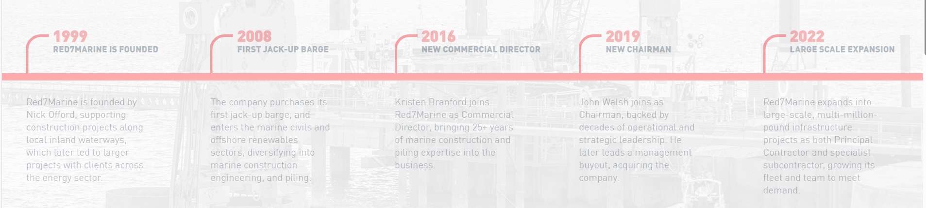
For the redesign of the award winning website – Red7Marine, we were tasked to create an animation effect to the static text for each timeline event.
The end result can be found on this link: red7marine.co.uk/about-us/, and below we detail the steps involved in making something like this for yourself.
1. Create any graphics as SVGs
If you have any graphical or shaped elements that can’t be created with CSS alone then you need to create these as vector SVGs, as apposed to a PNG image for instance. This is so we can animate the sections of the shape, overwise CSS will only see a flat single shape. An SVG has every shape as a path which we can use to animate.

2. Create the HTML and CSS Styles
Layout the text and images using absolute positioning to get the finished look of the timeline ready.

3. Set a Pre-animated Version of the Design
Start all elements as either faded out / shrunk down or hidden. In their starting state basically. So, for the text, we dropped the opacity down. For the lines, we had to create 2 versions, one that is faded out and static (that you can see), the other that is width and stroke 0 as their starting states.
4. Make the Solid Horizontal Line Animate in
The first bit of animation is the main timeline, horizontal line. Use CSS animation and keyframes to take the width from 0 to 100% at a reasonably slow rate to allow the user to read. Example below:
.redline {

	animation: fullline 15s;

	animation-fill-mode: forwards;

	animation-timing-function: linear;

	animation-delay: 1s;

}

@keyframes fullline {

	to {width:100%}

}
5. Make any SVG Paths Animate
Again using CSS animation, change the state from the starting position (in our example stroke 0), to the end position (stroke 100%). In our example we used the stroke-dashoffset element to fill the shape from 0 to 100%. Example below:
.roundpath{

	stroke-dasharray:435.59698486328125;

	stroke-dashoffset:435.59698486328125;

	animation: sign 6s ease;

	animation-fill-mode: forwards;

    animation-delay: 1s;

}

@keyframes sign {

   to {stroke-dashoffset:0;}

}
6. Add CSS Animation to the Text to Fade in
The final bit of animation is for the text elements. We simply faded the opacity from 10% to 100%. You could also add timeline numbers that fade in and move up slightly with absolute positioning on the top. Example below:
.journey-text {

	animation: fadejourneytext 1.8s ease;

	animation-fill-mode: forwards;

    animation-delay: 1.4s;

}

@keyframes fadejourneytext {

   to { opacity:1;}

}
7. Finally, Add CSS Transition-delays
Add to each of the sections to make them appear at the correct time. This is the critical part to get all the elements to load in nicely. So you need to have each timeline point start to animate once the large line reaches that section. Example below:
.journey-text-two {

    animation-delay: 2s;

}
What About Mobiles?
To have this also work on mobile you need to make the design responsive. So keep the same principle and animation in place but simply change the design to be vertical. So the timeline would animate the height to 100% instead of the width and the position of all the elements wouldn’t need to be absolute anymore as they just stack under one another. The SVG shape, used in the example, can then just be flipped using: transform: rotate(-90deg);
